The colors of a Louisiana life are vastly different than the coastal light in Maine, or the long shadows of the mountains in Montana. Things are warmer, softer and less predictable than the stark whites and navy blues that dominated for years.
When it comes to redecorating, a fresh coat of paint is likely the best return on investment. The cost is minimal, but the results can improve the looks of a room dramatically. That is — if the paint is the right color.
This is part two of the newspaper’s color trends series, where we asked four Louisiana designers to share their thoughts on colors in Louisiana homes right now:
How does Baton Rouge’s light and architecture change what works here versus what’s trending nationally?
Designer Jerad Gardemal
PROVIDED PHOTO
Jerad Gardemal — founder and principal designer at JF Gardemal Designs: Nationally, we’re seeing a strong shift toward warmer, nature-inspired palettes. Browns, olive greens, clay tones and warm neutrals are replacing the cool grays and saturated whites that have dominated the past several years.
This trend feels especially appropriate for Baton Rouge.
Our warm, abundant natural light intensifies colors, so shades that appear soft and understated elsewhere can become much more vibrant here. Combined with our region’s rich architectural heritage, the colors naturally favor warm, organic colors over cooler palettes. We don’t follow the trend as much as adapt it to our specific environment, creating homes that feel authentic to South Louisiana.
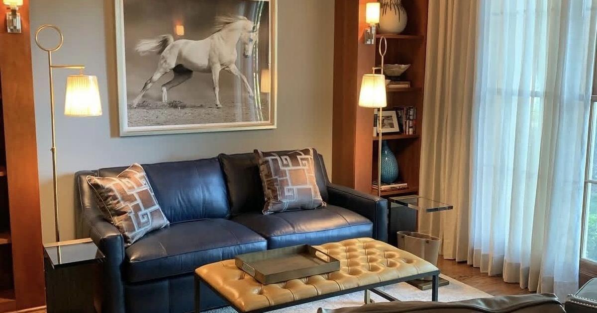
Pictured is a project from Louisiana designer Rachel Cannon.
Kim Meadowlark
Rachel Cannon — founder, creative director and principal interior designer at Rachel Cannon Limited: Excellent question, because there is a difference. Baton Rouge doesn’t have the bright, bouncy coastal light or the high rise glass towers that we’ve designed in other markets, so I find myself having to rely heavily on my training in the science of color and lighting to get paint to do what I want it to do in our clients’ homes.
If I could urge homeowners to do just one thing, it would be to add windows anywhere they possibly can, including powder rooms and closets. Natural light changes everything.
Kristina Petit — founder and residential designer at Kristina’s Collective Interiors: Baton Rouge and New Orleans have very southern, Spanish-style architecture often times, which lends itself (in my opinion) to warmer, more European colors versus modern cool tones.
Residential designer Kristina Petit, owner of Kristina’s Collective Interiors.
PROVIDED PHOTO
Are there any specific color pairings you’re noticing this year?
Petit: I’m loving and seeing more chartreuse and red. Not necessarily together, but their such fun pops in any space that feel unexpected but really warm up a space.
Cannon: I’ve recently become very inspired by an Instagram account called @art2life_world, led by artist Nicholas Wilton. His videos showing unique color pairings have been a great source for me to pull from in my work, beyond the basic color wheel foundation I learned in design school at LSU.
Designer Jared Gardemal says the most enduring materials are built around timeless architecture, beautiful materials and a layered palette.
PROVIDED PHOTO
Gardemal: There are a few pairings we really like to share with our clients when working on an initial design discovery presentation. Soft limestone and camel are warm and understated and completely timeless. Terracotta and creamy white are earthy and welcoming. Deep forest green paired with antique gold is rich, elegant and very classic.
What’s the color you think we’ll all be sick of in five years?
Cannon: I think we’ll be past the butter yellow trend (and other powdery pastels) sooner than that. My prediction is we’ll see a swing toward richer tones like butterscotch, rust, forest green, and navy. Trend cycles are all about extremes!
Rachel Cannon is the founder, creative director and principal interior designer at Rachel Cannon Limited.
Kim Meadowlark
Petit: I’m not sure! I love all colors and think the way you use it totally changes the dynamic.
Gardemal: If I had to make a prediction, I’d say olive green. It’s a favorite color today because it’s grounded and beautifully connected to nature. But we’re seeing it everywhere from kitchen cabinets to furnishings and textiles.
But I always encourage clients to use trendier colors thoughtfully rather than making them a defining feature of a home. The most enduring interiors aren’t built around the color of the moment. They’re built around timeless architecture, beautiful materials and a layered palette that will still feel relevant years from now.
This project from designer Jeanne Lyons Davis includes wallpaper in specific parts of the kitchen, along with painted cabinets and gold hardware.
PROVIDED PHOTO
Jeanne Lyons Davis, writer and designer: Trend blinders are inevitable, so I try not to chase them. My rule: If you walk into a room and it makes you smile, you’ll still be smiling in five years. Follow your gut, not the forecast!